Year: August 2022
Duration: 6 months
Role: UX/UI designer in scrum team
Client: PLUS supermarket
Background
PLUS supermarkets must efficiently manage their inventory to ensure smooth operations. Employees perform daily inventory checks, which can be prompted by system alerts, waste management needs, or random spot checks conducted by staff.
Understanding the problem
The current application used in PLUS supermarkets presents a significant UX challenge, with a complex and un-intuitive interface that impedes user navigation and task completion.
The goal
The goal was to create an application that is going to used by +550 PLUS supermarkets to save time and operate more effectively on their stock inventory.
I set up a design process and worked collaboratively with the HQ business process owners to define a Most Viable Product that would address the most critical pain points and deliver the most significant value to users.
In the first phase of the project, we focused on developing an MVP with three core features: directed counts, undirected counts, and stock corrections. In a later phase the integrations with third-parties systems, such as G&A (ERP software) were made.
The scope was defined, so I set up a design process to keep everybody involved on the project aligned.
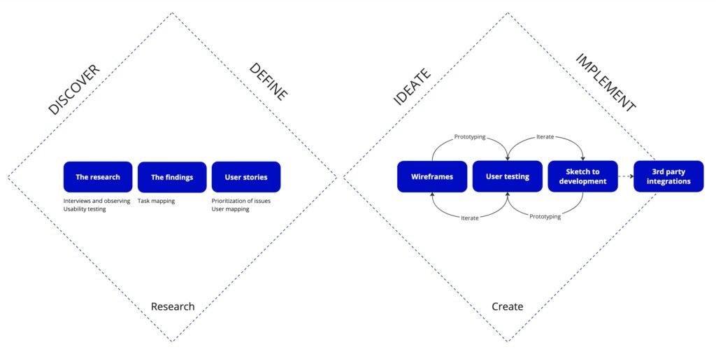
The research
Utilized a mix of research methods, including:
- Interviewing and observing at PLUS stores
- Interviewing PLUS headquarters business process owners
Interviewing and observing
I conducted user research by interviewing and observing users at 3 PLUS stores. This allowed me to gain insights into their needs, goals, and pain points.

The main findings
FINDING 1
Inconsistency and task interruptions create frustrations
During usability testing, it became evident that users encountered significant challenges due to inconsistency in the application’s interface and functionality. Users found it confusing when elements didn’t maintain uniformity in appearance or behavior across different sections of the application. This inconsistency led to task interruption, causing frustration as users had to continuously adapt to varying interaction patterns.
Furthermore, the frequent need to switch between different features within the application exacerbated the problem. Users reported frustration with the interruption caused by having to navigate between disparate features, disrupting their workflow and slowing down task completion. This task interruption not only impeded user productivity but also contributed to a sense of inefficiency.
FINDING 2
New employees struggle with usability
New employees used to find it time-consuming to learn how to use the application due to its lack of intuitive design. They struggled to understand how to navigate the interface and complete tasks, which led to disengagement and decreased productivity. The application had a steep learning curve, requiring new hires to invest more time and effort to become proficient, thus delaying their ability to perform their job duties efficiently. Consequently, they often required extensive training and ongoing support to overcome usability challenges.
Design
The research phase was finished, time to move on to the design.
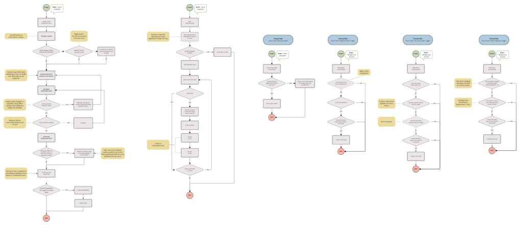
Task mapping
Based on my findings, I developed together with my team a task flow diagram, identifying the different features and functionalities of the app and determining how they related to each other. From this, I conceptualized a new feature – the article dashboard – which enables users to initiate processes directly, rather than having to navigate to a specific feature. Working closely with the PLUS business team, we decided to include this feature in the MVP scope.
Wireframes
I created wireframes, which served as blueprints for the PLUS StoreOps interface, using Miro to refine the design through a few iterations. I also gathered feedback from the PLUS business team at this stage.
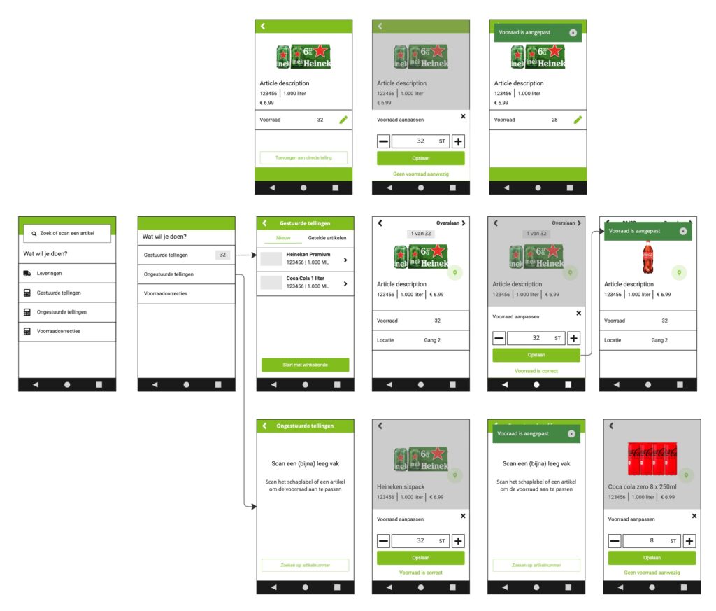
To validate my wireframes and ensure that it meets the users’ needs, I showed the wireframes to the same users I spoke with before. I made some small improvements such as default input and copy.
In this stage I also closely worked together with the development team, to make sure that the wireframes meet the technical requirements.
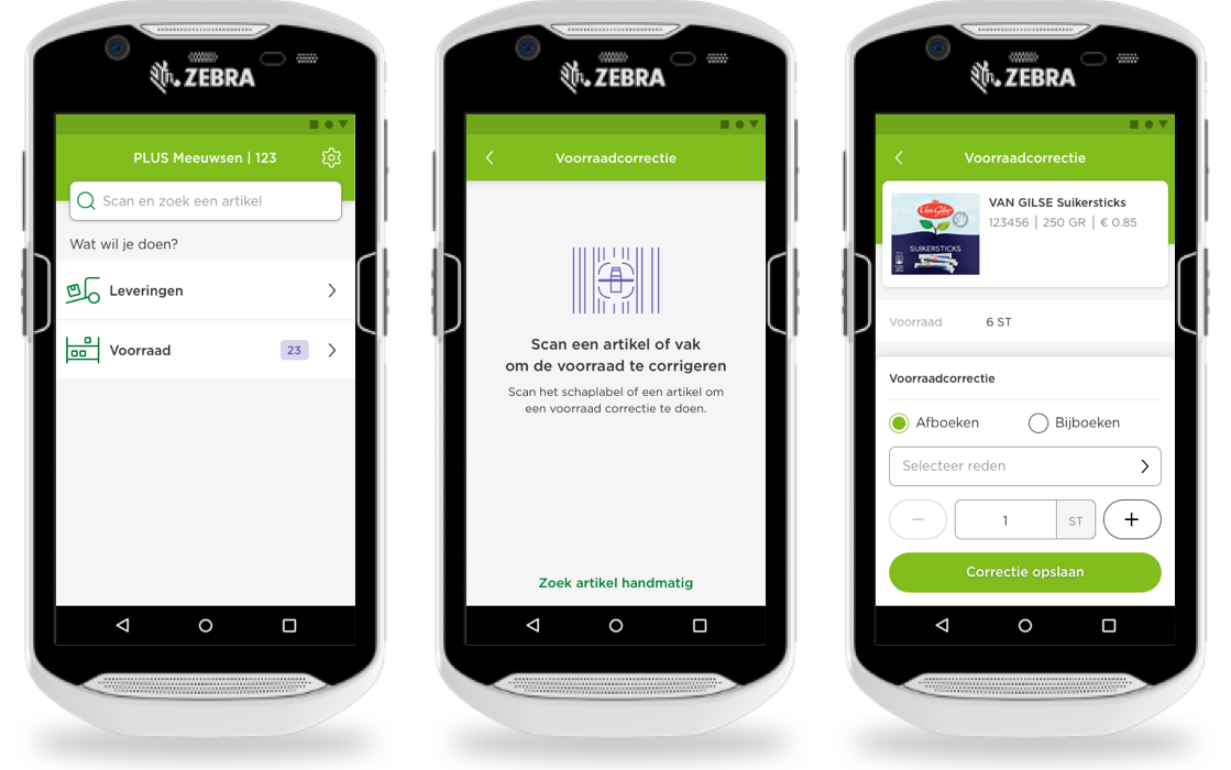
Final solution
I then moved on to the visual design stage, using Sketch to bring my designs to life. Fortunately, another team had already started with a design system, which I leveraged to ensure consistency with the brand identity, typography, and icons.
This video shows the final product and was used to introduce StoreOps at PLUS. Start at 0:46 to see the new design.
Finally, working with a multidisciplinary team with sprints of 2 weeks, I delivered the designs to the developers. I collaborated with the product owner to prioritize the backlog and facilitate refinements. PLUS StoreOps was built with OutSystems.
Usability testing
I took the initiative to create a usability test plan while the development team worked on the new application. With the business being unfamiliar with usability testing, it was crucial for me to include a range of elements to ensure the testing was effective. This included defining clear goals and objectives, selecting appropriate methods, developing relevant scenarios, and creating tasks that aligned with the user’s goals.
After the new application was delivered, I conducted the usability test at five different supermarkets, which had not been previously exposed to the PLUS StoreOps system, to ensure an unbiased evaluation. The results of the testing showed clear patterns in user behavior, which I then organized and analyzed using Airtable.
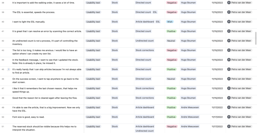
Based on the findings, I wrote a comprehensive report for all stakeholders and team members, detailing positive feedback, opportunities for optimization, and future recommendations for the next phase of development.
During my store visits I also conducted a System Usability Score to compare the current and new application.
There was an uplift of 14%, despite the fact that integrations with third-party systems were not yet made.
Takeaways
Overall, I thoroughly enjoyed working on this project! Collaborating closely with the business and my team members presented significant challenges, but it was also extremely insightful. Hearing the feedback from real users and seeing their reactions was the most rewarding part of the project.